
Data Weaving
Science communication project, 2023. weaving with data. This creative piece is a woven table runner, made of overlaid temperature and threatened species data. It aims to bring to attention the impact rising temperatures will have on Australia’s wildlife and broader biodiversity.
While the data is accurate, it is not meant to be as precise or readable as other visualisations. Instead, it is designed to be a conversation piece. By being a functional, common household object, it may be placed at dinner events, in the lounge room, or in other social spaces to invite a deeper discussion.
These discussions are essential for small-scale science communication in the home, that can then be passed onwards into the more global discourse.
The pattern is also applicable to other region-specific data sets. It can be taken up by other weavers to create their own interpretation based on where they live, and what climate data they see as important in that region. By overlaying two data sets, the approach can be adapted to a wide variety of stories. In this way, the table runner acts as a prototype for what could be turned into a wider community engagement project in the future.
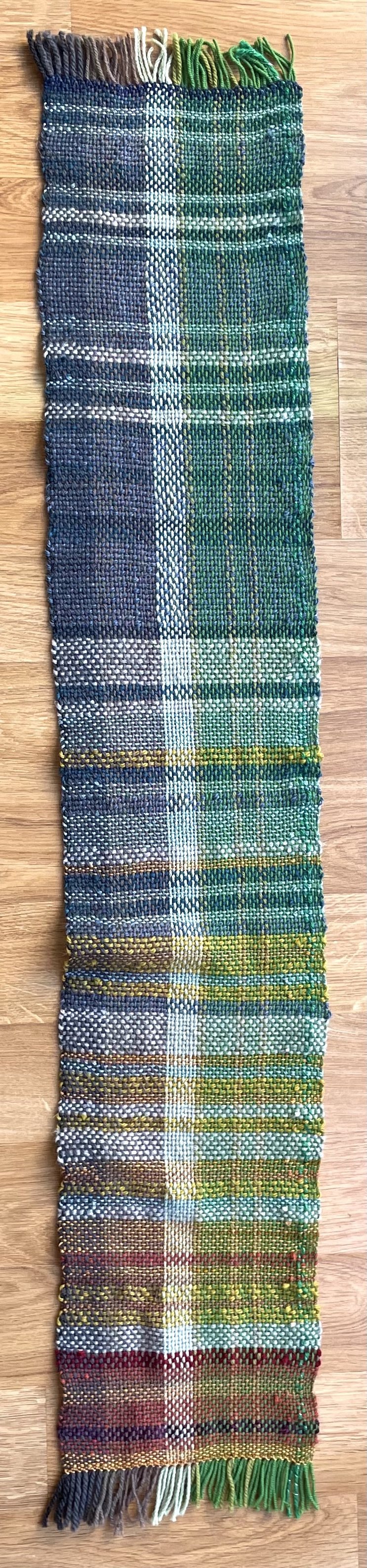
The climate data (weft) is inspired by the climate stripes, and
taken from the BOM (Bureau of Meteorology, 2023). It shows the annual mean temperature anomaly in Australia from 1917 to 2022. I arranged the data into bins in excel and assigned each value one of 12 colours.
The biodiversity data (warp) is similarly inspired by the biodiversity stripes which uses the Living Planet Index (LPI) as a data source (Richardson, 2022). However, the LPI does not have Australian- specific data, so I used an equivalent Australian index (Threatened Species Index, 2022). It shows biodiversity losses from near threatened to critically endangered terrestrial species between 1985 and 2018.


